Archive for May 2015

OUGD501 – James Smith – COP – Evaluation


Evaluation

Overall OUGD501 for me was a big step up from my work in OUGD401 as I took on a more academic task in this module. I am happy with the outcome of my essay as I started with a good body of research and had a strong conclusion.

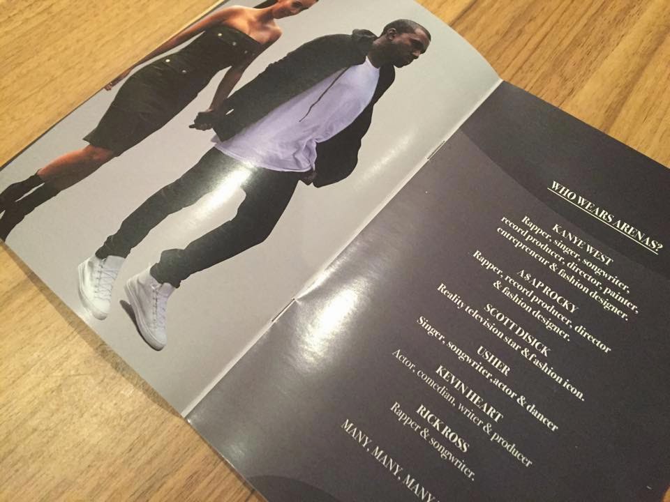
I am also happy with my essay design response as I felt that it linked in well with my essay and my own beliefs. MY response was a unique style of advertising, named  ‘Advertorial’, which was very flexible to use in many different types of media. My response also got very good feedback when presented to the audience of men’s magazines.

At the start of this module, I completed my dyslexia test, and after being classed as dyslexic, I was a bit apprehensive when starting my essay, as I did not want this module to drag my other grades down. However, I feel that I did a lot of work to a higher standard than I first expected.

I feel like the study tasks tended to be more difficult than the essay itself, although I did manage to complete them all to a standard, which I am personally happy with.

If I was to carry out this module again, I would of still picked the same task. The only thing I would change about my essay is that I feel like I could have added a few more references within my work. However this may not be needed. I would of done more study task practice to improve my writing and I would of took more time to analyse more advertising styles, to get a greater academic understanding of adverts.

Monday 18 May 2015 by James Smith
Categories: | Leave a comment

OUGD501 - COP3 Proposal

by James Smith
Categories: | Leave a comment

OUGD501 - Essay

by James Smith
Categories: | Leave a comment

OUGD501 - Final book prints

Final book prints

Printed in digital print. LCA.

This shows my design as a GQ advert. The advert is Paco Rabanne (fig 3-5). The only problem for this style of advertisement to be in a GQ magazine, is that it may cost the company too much to be in 3 pages of the magazine, which they may not be willing to pay.

This design is simple and still informative, putting across a style which the audience can engage with.

The print was on a gloss paper, same as the GQ magazine. Pagination was a slight issue, as the double sided print was slightly off.


This shows my ‘Advertorial’ proposal in a A5 magazine form. The advert consists of an introduction to Rolex, an introduction to the product, key information about the product, quotes from Rolex, variations of the products and how much they cost.

The front cover is only for my COP submission. If the magazine was mass printed, the magazine will have its own brand

This design is simple and still informative, putting across a style which the audience can engage with.

The print was on a gloss paper, same as the fashion magazine. Pagination was a slight issue, as the double sided print was slightly off, but not as much as the A4 GQ prints.

This proposal would be more approprate as the magazine can have as many ‘Advertorial’ adverts as possible. The magazine can also create a theme within, so it will look more professional.


Sunday 17 May 2015 by James Smith
Categories: | Leave a comment

OUGD501 - Final advertorial adverts

Final advertorial adverts


This is my Paco Rabanne advert proposal. The advert consists of an introduction to Paco Rabanne, an introduction to the product, key information about the product, what the public think about the product and the prices.

The design separates the images from the text to keep the theme of high resolution images, in order to show the unique bottle design. The Paco Robanne models were also essential for the advert as this is their way of selling to their audience, suggesting to the audience that their product is a necessity if they want the lifestyle of the model shown.


This is my Balenciaga advert proposal. The advert consists of an introduction to Balenciaga, an introduction to the product, key information about the product, quotes from stylists, who wears the products, how much they cost and other/similar Balenciaga products.

Other Balenciaga products are shown in a catalogue style as all Balenciaga products are generally advertised equally. The idea of ‘Who wears arenas?’, is used as Balenciaga promote themselves on the amount of celebrities that wear their products and this is a big selling point for the brand as a lot of people look to celebrities for style.


This is my Rolex advert proposal. The advert consists of an introduction to Rolex, an introduction to the product, key information about the product, quotes from Rolex, variations of the products and how much they cost

From my research, the main aspect of a Rolex advert was the high resolution photographs of their products, and so this was carried out within my design. This was achieved by giving the products their own page, separating them from the text. The background colours are very important in this advertisement, as it needed to keep a simple ans sophisticated style.


To put my magazine into context, I mocked the design up before I got it prinited. This shows one of the styles that the ‘advertorial’ design could be presented in.

This mockup is a magazine made spelifically for ‘advertorial’ style advertisments, were the reader can learn about the companies/brands, which viewing new produces which they could buy.

A good example of why this could be sucessful is the Paco Rabanne advert, as it highlights that the product is a ‘winter product, therefore if the advert was released in winter, the reader may take that as a good reason to buy the product.

This design board shows one mock-up page from a Paco Robanne and Balenciga Arena advert. This also shows a full mock-up of a Rolex advert.


by James Smith
Categories: | Leave a comment

OUGD501 - First Things First - Triangulating an Arguement


The World Wide Fund for Nature is an international non-governmental organization founded on April 29, 1961, and is working on issues regarding the conservation, research and restoration of the environment.

This peace of graphic design was created to inform the audience about the awareness of decreasing shark popularity and provokes thought into how the audience can be involved.

This design is relevant to the FFF revisited manifesto, "We have absorbed design so deeply into ourselves that we no longer recognize the myriad ways in which it prompts, cajoles, disturbs and excites us" - revisited as it highlights the amount of graphic design that is pumped out into the world and the effects this brings. With this in mind, it shows the amount of effort and talent a graphic designer will have to achieve to be able to consistently produce effective graphic design.

"By far the greatest effort of those working in the advertising industry are wasted on these trivial purposes, which contribute little or nothing to our national prosperity" - 1964, connects with the revisited manifesto as it shows that there are so many graphic designers producing non functional work, therefore changing the way the audience perceives. 

- how it impavts
- compare to first ( waste time so stuff doesnt exite any more)
compare to a old shark one - this has to be more shocking?

which is important because


"29"


graphics for cutlture and communication rather comunierism

extingtion of sharks to extintion f graphics not for advertising

by James Smith
Categories: | Leave a comment

OUGD501 - Paco Rabanne initial idea mockup


by James Smith
Categories: | Leave a comment