Foure is a luxury streetwear brand,
Originated In Manchester, United Kingdom.
Established IN 2015.
Within the last five years, the streetwear style was adopted by Hip Hop culture, which elevated its image through limited edition products with high prices. This was an example of who ever has the political power, sets the trends.
This prompted an idea to produce a brand which was inspired by the Hip Hop culture, but that differed in that the items would be of better quality at an affordable price range for a young target audience.


The research into branding for the dissertation helped to achieve an understanding of what is needed to create a successful brand.
This raised awareness of the importance of marketing through appropriate brand creation and brand identity in order to encourage loyalty amongst the target audience.
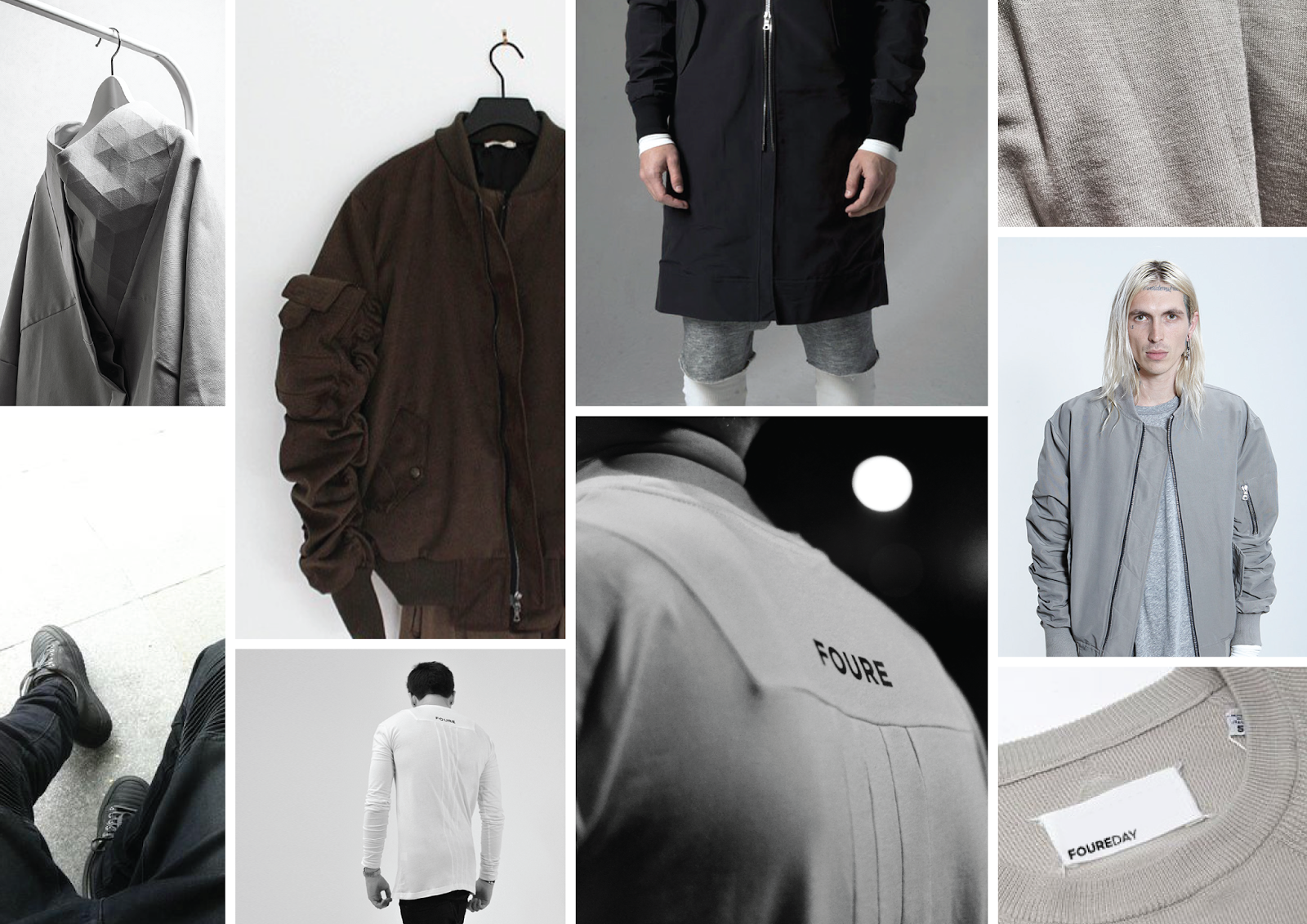
The ‘Foure’ logo was created using the typeface ‘Gotham’. This design decision was made a ‘Gotham’ is a well respected typeface within the fashion industry as it is well known for being the typeface for ‘GQ’, which links with the brand ‘Foure’ as the magazine ‘GQ’ is known for luxury items and clothing.
The typeface has a simple, bold and luxury aesthetic which will work well with the aesthetics of the brands products.

The name ‘Foure’ comes with the concept that is can be used as the word 'for', also adding another small USP to the brand.
For the essential range, the ‘foure / for’ concept will be used throughout.
White items will be named ‘Foure Day’.
Grey items will be named ‘Foure Dusk’.
Black items will be named ‘Foure Night’.
‘Foure Men’ and ‘Foure Women’ will also be used on the website to continue this concept.
Off white, brown and olive have also been chosen for possible colours within 2015/16 and these colours have been proven popular colours at the moment.

Aa ‘Foure’ is Branded as a ‘luxury streetwear brand’, the photographs used for the website and promotion all need to be of high quality. Therefore the 'Foure website' will be made with a simple aesthetic to allow the use of high quality images at a the largest scale possible.
The website would only be used to show lookbooks and sell products, therefore having a simple website, rather than a 'creative' website would not have any negative effects on the company.


